Oscar Mayer Rebrands Entire Product Line
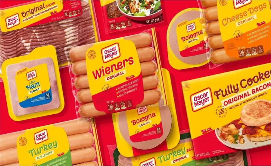
The 138-year old brand realized its products took on very different looks and tones within the brand’s portfolio as time went on and wanted to better reflect the world today. Here’s a look at what they’re changing: Updated logo and refreshed packaging designs from branding agency BrandOpus that cohesively feature the brand’s iconic “never square” logo shape. The branding/packaging updates highlight four distinctive design territories for the brand: 1. The Oscar Mayer rhomboid. The rhomboid’s movement and dynamism spark new joyful energy and serve as an iconic visual tool that creates cohesion across the entire portfolio. 2. Oscar Mayer yellow: This distinctive shade of yellow is featured prominently and drives recognition and distinctiveness across all brand touchpoints. 3. A custom typeface highlights the playful nature of the Oscar Mayer brand has been integrated into all packaging. 4. The Wienermobile. This iconic symbol will unite the entire portfolio of products while figuratively driving the brand forward into more modern times. These branding updates can also be seen in the brand’s new creative platform from global advertising agency Johannes Leonardo called “Keep it Oscar,” which invites everyone to see the world through meat-colored glasses and take life less seriously by reimagining meat in playful, unexpected ways.
Looking for a reprint of this article?
From high-res PDFs to custom plaques, order your copy today!


