Editor’s Note
Summer Suncare Line Up
An effective product line design makes this brand shine.
Spring in Michigan can be freezing one day and sweltering the next. If you're lucky enough to be in Michigan throughout March and April, there is a good chance you will need both gloves and sunscreen. Having the fairest skin of all, I have officially begun sorting through the sunscreen bin. Yes, bin. I stockpile sunscreen. And I’m picky about the brands I use. First, it has to work (obviously), but the formula can't be too thick and leave white streaks. It also has to smell good (like summer). Most importantly, because multiple bottles will line my bathroom countertop for months, the brand has to have good packaging. A lot to ask, I know. But, last summer, I hit the sunscreen jackpot.
COOLA is my new obsession. Yes, I pay full-price and, no, this is not an ad. When I like a product, I buy the entire product line. Options are a wonderful thing. What’s not wonderful is searching through lookalike products for what you want. One of the things I love about COOLA, a multi-product brand, is I can differentiate between the entire line easily.
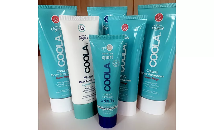
Creative strategist and a contributor to this issue, Jenn David Connolly, explains it best, “When designing for a large line of products, there are unique factors to consider: how to make each product look like part of the same family without feeling repetitious or boring, how to make each product look like they belong to the same family while maximizing their individuality.”
COOLA’s packaging accomplishes what Jenn recommends by having characteristics that unite similar products within the large group without too much differentiation, which can look busy and disjointed. Color plays a crucial factor in design, and COOLA uses it well. The teal and white colors on the tube packaging signal between classic and organic mineral formulas, while cap color is used to denote body or face application. Color coding is also used effectively for the SPF call-outs, so there’s no grabbing SPF 30 on days you need 50.
Cheers to the start of summer,
KRISTIN JOKER
jokerk@bnpmedia.com
Looking for a reprint of this article?
From high-res PDFs to custom plaques, order your copy today!


