Brand Packaging
When Packaging Signals Change
Packaging is helping U.S. period care and wellness brand Cora launch a new identity that coincides with an evolving narrative around period care.
Cora, a leading U.S.-based period care and wellness company, has launched a new brand identity to reclaim its stand-out on shelf, reinforce its relevance to the millennial consumer and cement its place as a leader in the menstrual care category.
Since Cora launched in 2016, the natural period care category has grown significantly with an abundance of product choices. But, even with so many options, shopping for period care remains an afterthought with most consumers trained to dash in and out of the aisle as quickly as possible.
Designed by creative agency Mother Design in close collaboration with Cora’s creative and marketing teams, the new identity gives Cora’s packaging, tone of voice and communications a bold look and feel, positioning it as the brand that shifts the conversation from an impersonal experience to a more relatable and personal one, rooted in comfort.
Courtesy of Red Setter
Shifting the Narrative
Molly Hayward, founder and CEO of Cora, explains: “Consumers want a real, relatable, empathetic experience and to know that we as a brand really get what they’re going through.”
Andrea McCulloch, VP brand & creative of Cora, adds, “We want to evolve period care to feel more like self-care. Branding inspired by skincare and beauty–packaging worthy of belonging on your bathroom countertop, not hidden away in the drawers below.”
The rebrand comes at a time when the sustainable feminine care category is growing significantly, projected to value more than $1.56 billion by 2027 end, and register a CAGR of 7%, according to MarketWatch. At the same time the division is growing between the synthetic mass brands everyone grew up with and newer brands that are using organic ingredients and offering reusable products that arguably feel more relevant to modern sensibilities.
Kathryn Jubrail, managing director of Mother Design, says, “The sector straddles a practical need to work and be efficient and the cultural conversation to do with our bodies and our identities. Consumers want an empathetic approach and understanding of their experiences that offers both emotional and physical comfort.”
Courtesy of Red Setter
Comfort Through the Uncomfortable
The rebrand addresses that dual need by including elements that convey authority, clarity and support but also feel real and relatable, capturing the highs and lows — the ebbs and flows — of everyone’s personal experience.
George Wu, design director of Mother Design, says, “We set out to provide comfort both at a product level but also on an emotional level. The new identity gives the brand the confidence to champion and be a partner in consumers’ physical care and wellbeing, but also to champion them culturally, recognizing that bodies and experiences are unique and ever-evolving.”
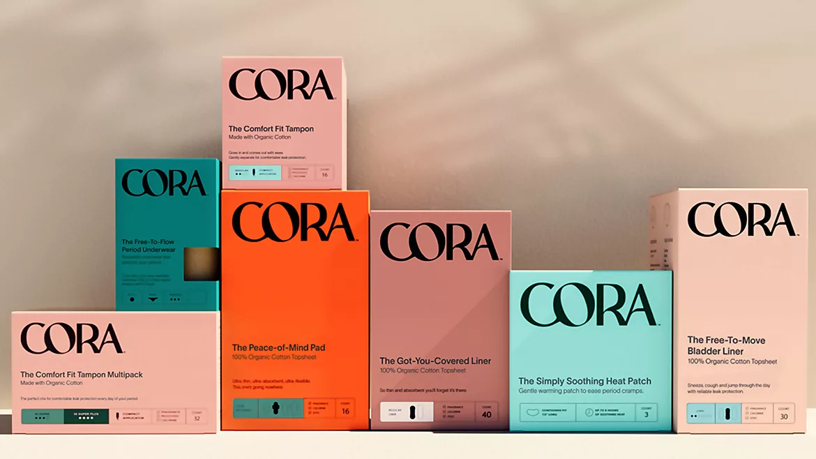
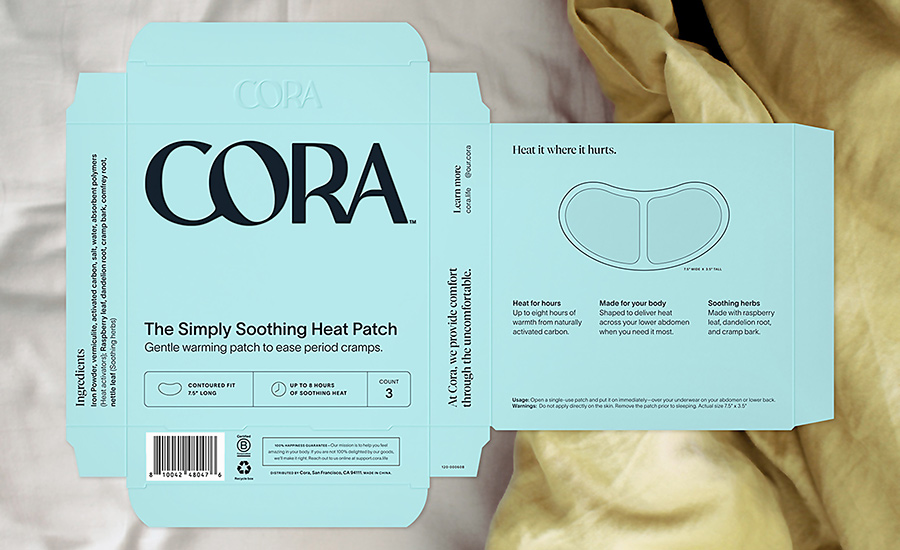
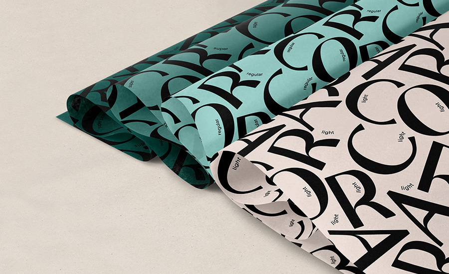
The new logo, crafted with a bespoke typeface, is bold and oversized, building brand recognition and conveying authority and support through its rounded, fluid and balanced design. The angled stress of the O is propped up by the C to give a feeling of support and care. The sloping bar that continues from the bowl of the R accentuates the feeling of fluidity. It has personality, feels human and denotes comfort through its curves.
Whereas the previous packaging heavily relied on white as the hero color, the new color palette feels modernized in its assortment of earthy tones. The strategic use of color and redesigned hierarchy system on packaging create an easier navigation experience for the consumer.
Striking the balance between the bright colors used by established competitors and the array of pastel-toned newcomers, Cora claims its own space through a distinctly modern color palette. Remaining functional and achieving shelf standout, each color denotes a different product line. The intuitive use of tones help distinguish between absorbency helping consumers to easily navigate the wide range.
Setting a New Tone
The new identity uses two typefaces, the first is clean and sophisticated which is partnered with a characterful editorial font. They are always used in combination to highlight words or phrases which bring a sense of duality and individuality to the brand’s expression.
Another key element of the design process was the product naming. Shifting to an emotionally driven tone of voice, Mother Design ensured Cora created a point of difference compared to its competitors. Borrowing from the beauty and self-care/wellness industry, all product names now lead with the emotional benefit (for example, The Comfort Fit Tampon, The Peace-of-Mind Pad, The Got-You-Covered Liner, and The Perfect Fit Disc), helping to align them with the broader category of self-care.
Looking for a reprint of this article?
From high-res PDFs to custom plaques, order your copy today!


