Wine specialist Laithwaites Rediscovers Adventurous Roots with LOVE
Laithwaite believes, like great wines, wine lovers come from everywhere and every age group. Photo courtesy of LOVE
Tapping into the spirit of fun and adventure at the heart of the business, the rebrand was done to help Laithwaites build rapport and reputation with a new generation of wine explorers.
With almost half a million subscribers built up over 50 years in the wine business, Laithwaites is recognized as one of the pioneers in direct-to-consumer wine retail. But with an increasingly crowded market and constant innovation in D2C subscriptions across sectors, they realized the importance of staying relevant and the opportunities a refreshed brand identity would bring.
Laithwaites CEO David Gates says, “We’ve been dedicated to breaking down barriers between winemakers and consumers since 1969 – and we’ve achieved great success in the process. This rebrand is about doubling down on our reason for being and reiterating what we’ve been saying since the start but in a bolder, more confident way. Like great wines, wine lovers come from everywhere and every age group. We now have a brand that speaks to them all.”
Rooted In a Spirit of Adventure
Channeling the company’s founding ethos and building on founder Tony Laithwaite’s legendary musings on the world of winemaking, the new identity is alive with color, texture and personality. Visually and verbally, it speaks to his love of wine and the world around it enabling the brand to engage more readily with a much wider demographic. Inspired by their trailblazing trips to undiscovered wine regions and continued discovery of exceptional, off-the-beaten track winemakers, the new Laithwaites brand promise, ‘”Your compass to a world of wine adventure” sets an exciting and involving course. It invites all wine lovers on a journey – regardless of experience or knowledge.
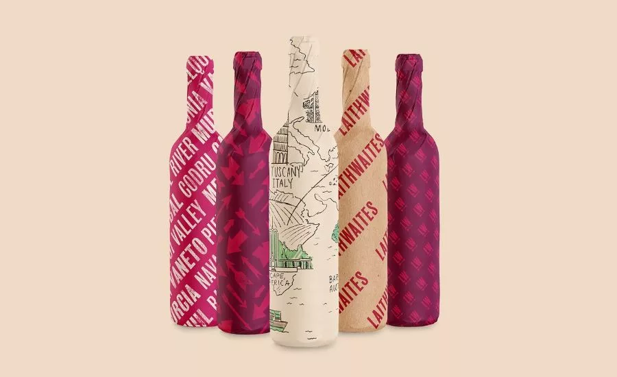
Down-to-Earth Design
Laithwaites has built its success on the relationships it has forged with winemakers and customers over the years, so the principles underpinning the new brand stem from a simple, down-to-earth truth: they are wine nuts, not wine snobs. They have and always will be champions of a more inclusive, less elitist world of wine. The visual identity includes new brand colors, block printed type, iconography, handwriting and witty and whimsical illustrations, including early sketches by Laithwaite, that evoke a well-travelled wine case. The apostrophe was dropped and the logo more clearly indicates the inclusive and modern business they are today. Interviews with Tony, his wife (and original business partner) Barbara, their three sons and the wider Laithwaites leadership, were used as inspiration for the brand’s new tone of voice. Complementing their existing wine writing in print and online, it gives the brand a single, larger-than-life voice to help spotlight the unique backstory, perspective and personality.
Looking for a reprint of this article?
From high-res PDFs to custom plaques, order your copy today!


